 Oakland Hip Hip Hooray Folks! While tonight isn't going to be a big discussion of things or an important announcement, it is something that I think deserves some celebration. This post makes 50 total posts on the blog, with a mildly impressive 49 different photos shared. Granted it's not a big number but it does mean that I've managed to successfully post on here twice a week for 25 weeks straight! I find this to be quite the accomplishment considering my typically short attention span. I can't say that everything that's gone up on here has been a winner but I hope that I've managed to at least keep you mildly entertained. So here's to celebrating this little milestone and moving onto to the next one.
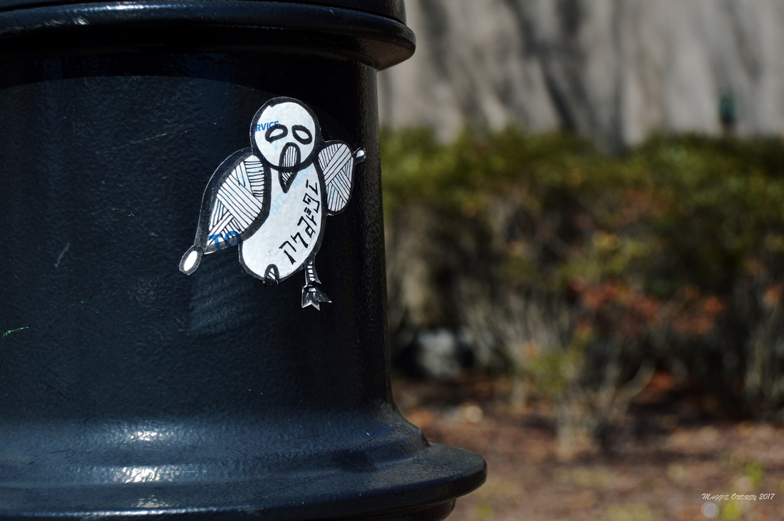
I didn't want to let my little celebration distract from an in depth post, so I thought I would reflect on the creative re-purposing of other stickers. I know I've looked at this a little bit before with my Pink elephant post back in December, but this is a pretty big element to the stickers you find on the street. A fair amount of the stickers that I see are hand drawn pieces that the creator has placed around the city. Obviously no two pieces are ever the same, each one exemplifying the artist's particular style, but they often share similar sticker bases. Some use the common name tags/ labels that you see at conventions. Others will use federal labels as the base, giving the drawing another dimension. But the label I see the most is the Post Office's mailing label. Being a free resource and easily available it's not hard to see why it's so common. Some of the first stickers that I recall finding back in college used this label as the base. Just going through my collection, I am constantly surprised by the number of people who have re-purposed this label for their own creative use and how unique each one is. I was a little disappointed when I didn't find anything on this particular sticker, but not terribly surprised. I can't quite make out the stylized characters along the bottom of the bird. I think there's definitely a 7, an A, and maybe an I but otherwise the handwriting is a little too personalized to truly comprehend. The simple design of the bird, while enjoyable, is lacking a defining quality that would also make it easy to find. However this doesn't diminish the impressive creativity that came up with this piece. A lot of the people who use these mailing labels tend to keep the whole label, filling up the space with their drawing. This obviously leaves the label intact and easy to see what it started off as. The bird above, on the other hand, is cut out making it the sole focus and gives it the ability to truly fit in with the world around it. Looking closely though, you can just make out the To in the wing and the end of the Service up in the head. So while this gives it a little added depth, it doesn't really distract from the simple line design of the bird. They truly make the sticker their own and really show off their unique style.
0 Comments
Leave a Reply. |
Maggie Ondrey
An amateur photographer and writer capturing a small portion of the city. Archives
August 2017
Categories |
 RSS Feed
