 Friendship When I'm photographing these stickers, I usually do my best to make them the sole focus of the image. Like a portrait, I want to draw your eye to the details of the sticker and let it's story speak for itself. But occasionally I do like to explore the environment the sticker is in. It often changes the way you see the sticker and it also serves as a bit of a reminder of how small these things are. It also creates a nice change of pace in the collection.
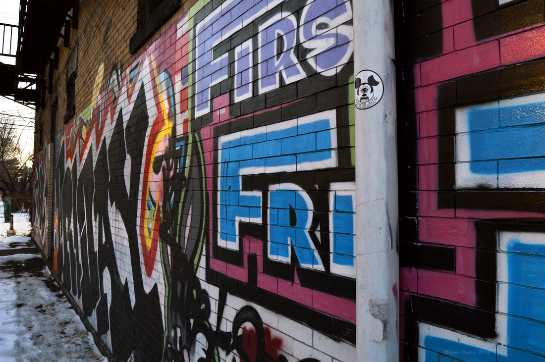
Today's image is a bit of a "Where's Waldo" for people who aren't fully initiated to my sticker hunt but if you look at the white pipe on the right side of the screen you will see the sticker. It's a cyclops Mickey Mouse, which brings up an interesting collection of images in Google but nothing that is definitely this sticker. But digging a bit into the hoard that is my collection, I did find another exposure I took that was a bit closer to the wall and the sticker. On that one you can clearly see the web address, obsoleteimages.com under the word obsolete. Now I can't say I was really sure what to expect going by the sticker, which is the logo for the site, but I was a little surprised by what I found. Before I go on to detail my thoughts on the site, I will quickly apologize. I'm not sure what platform this individual is using to host his site, possibly Tumblr, but when I opened it up using Firefox only a small portion of the site actually loaded for me and it did eventually cause me to force close Firefox. So I can't say that I know what exactly you will be seeing, if you end up seeing anything, but I don't think that should completely deter you from checking the site out. Now that my disclaimer is out there, what I found was a photographer's personal website/possible portfolio. As you can probably deduce from the choice of logo, Christopher Thomas Moore is not your typical photographer. He does seem to specialize in portraits, but he aims to create portraits that defy conventions and are far more artistic. He likes to explore the more intimate nature of his subjects, often having them expose portions of their bodies or focusing on elements of their bodies that are not their face. But even with images where you can't see the model's face you can feel how comfortable they are with themselves and who they are. The juxtaposition of the model and her surroundings are often beautiful and keeps the eye engaged throughout. He is clearly a photographer who understands how to balance the ideas we traditionally hold with portrait photography and defying those conventions. I think that the location of his logo works really well with this photo. Sitting on the end of a wall covered in such colorful graffiti, there is definitely a chance for it to become swallowed by it's surroundings. But with the added benefit of being a truly white image on an off-white pipe, it stands out and catches your eye. And like his photography, it causes you to really be engaged with logo and still be enthralled by the background.
1 Comment
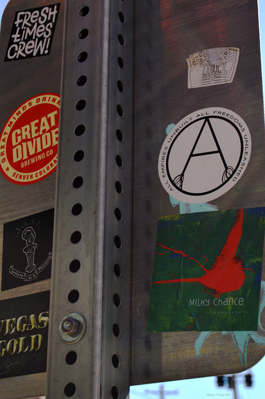 Oakland The back of this sign holds an interesting collection of stickers. I have to admit, when I took the photograph originally the only one I picked up on was the Milky Chance sticker. They're an alt rock band that has been gaining popularity over the last couple of years. I was immediately taken with their song "Stolen Dance" when it became a regular play on the radio and have kept an ear on them ever since. Their song "Flashed Junk Mind" is currently one of my favorites and I put it's music video at the bottom of the post for your enjoyment. Looking into these stickers for the post, a couple popped up pretty easily. The Great Divide Brewing Co is a craft beer brewery in Denver, as clearly evidenced in the sticker. But checking out the brewery's page I found out that it's a company that's dedicated not only to it's product but also to the environment and the Denver community. With 6 beers brewed year round, plenty of seasonal ones and names like Yeti Imperial Stout, I'm definitely going to have to give them a try the next time I see it a bar. Something Like A Monument, the black sticker with an ear on a pedestal, is a band from the Philly area. While I've always been an avid music fan, I can't say I've ever been ahead of the game, finding new bands before they hit the radio. After listening to their track "The Hours Believe", I can say that this was a delightful discovery. I would say they fall very easily into the alt rock category, reminding me of a little of Queens of the Stone Age and worth a listen. The last couple of stickers are definitely a bit harder to decipher. Looking up Vegas Gold doesn't really bring anything up that can be clearly tied to this sticker. I did find out that Vegas gold is the particular shade of gold that the Pittsburgh Penguins has been using for their logo and jerseys. Apparently they are going back to a Pittsburgh Gold for this season. So there is a chance that this Vegas Gold sticker is referencing the Penguin's use of the color but I wouldn't put money on it. The sticker of the A surrounded by the phrase "All Empires Unbuilt All Freedoms Unleashed," I had no luck pulling anything up on Google for it. If I had to make an educated guess, I would say that this was probably a personal version of the anarchy symbol. Whether it's something that originated here or migrated here from else where I couldn't tell you. And I've got nothing for the Fresh Times Crew! but I see that one pretty often, so I may try again later. I do feel a bit bad that I really had no great depth to any of these stickers for such a long post, but sometimes it's just an overwhelming amount of information to decipher on these signs. I wouldn't be surprised if I end up posted some of these stickers again, I don't even remember what all is currently in my collection. Hopefully it gave a little bit of insight to the large variety you can find around the city though. And as promised above, here's the music video to one of my favorite songs by Milky Chance. Enjoy! 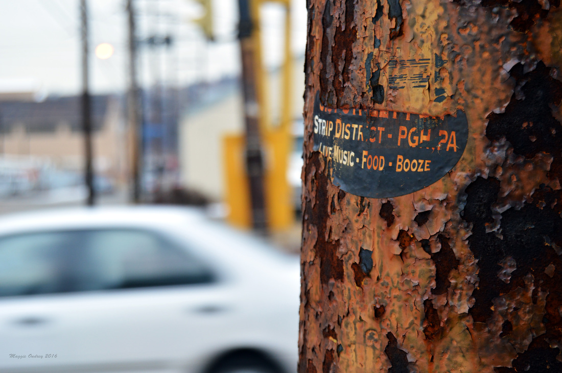 Strip District Graffiti is in it's nature a temporary thing. Cities remove the tags and pieces by power washing or painting over them. Other artists reuse the space either erasing the previous tenant or creating a unique interplay between the two. The cultural references they use to make their point fade in their relevance. Even the weather contributes to the dissolving of these creative moments. But finding these temporary moments and seeing how they change in their environment is part of the fun.
The sticker above is a perfect example of the temporary nature of sticker graffiti. I'm pretty sure that this sticker used to be an advertisement for the now closed 31st Street Pub over in the Strip District but it's hard to say for certain. The weather and rust from the pole have caused it to lose the name of the bar, leaving behind live music, food, and booze in the Strip District. The remains of the sticker becoming a poignant statement about some of the appeal of the neighborhood. While the area may be in a discussion about redeveloping itself to become a bigger attraction, it remains a big element in the food arena for Pittsburgh. Part of what I love about this photo is the way the sticker has melded in with the tarnished rust on the pole. Along with the lost of the name of the bar, it takes on much of the color from the rust. It is almost indistinguishable from it's surroundings and isn't something that you would immediately notice. I know I found it because I'm always on the look out for things like this, ones that exemplify how easy these stickers change with time. These kind of finds are a large part of what I enjoy about this project. 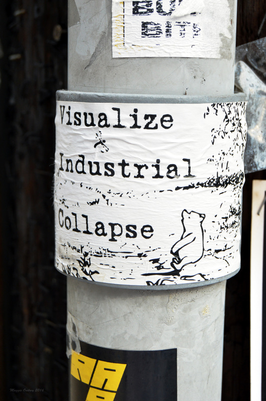 Shadyside  I have to apologize for tonight's late post, I started to look into this sticker and the meaning behind it but realized that I bit off a little more than I could chew. I find this image and phrase fascinating but the further I try to delve into it the more confused I become. Granted my research is just what I can come up with using the internet but I seem to be hitting a dead end. Luckily for you I can guarantee that this sticker will come up again, so I will try to unpack some of the meaning tonight and will hopefully be able to come up with more later on.
I really enjoy the juxtaposition of the two elements of this sticker. The image is clearly a classic illustration of Winnie-the-Pooh from the original publication. A symbol of a simpler time, when adventure was everywhere and you were full of wonder. Before Disney bought the rights to this British child's story and made it into the recognizable phenomenon that it is today. The picture is making a statement in two different ways, harking back to the innocence of childhood and to a time before mass consumerism. The phrase Visualize Industrial Collapse is what has been really throwing me with this post. I find it captivating, the idea of a world without industry that has allowed nature to take it back over. It's definitely a statement that's tied to environmental groups and the desire to help the Earth. My problem is that I can't seem to find where it started. There's a blog post from 2005 that discusses the group Coalition Against Civilization after seeing the phrase on a bumper sticker on their table. There's also a throw away statement about the phrase in a piece discussing living in the rust belt that attributes it to a group Earth First!. I've also been able to find a website that let's you buy a bumper sticker with the phrase. But when I look into both of these groups I can't see the phrase anywhere in their known slogans or discussions. And while it doesn't take much to deduce what the phrase is saying, it would be nice to see the reasoning behind it's creation. The combination of the two items really make it an intriguing sticker. A call to let society reduce it's impact on the Earth and revert back to a child like sensibility and wonder of the world. To reject consumerism and the need to fill our lives with meaningless distractions. I feel like I'm just scratching the surface of this wonderfully captivating image but I hope it's an interesting start. 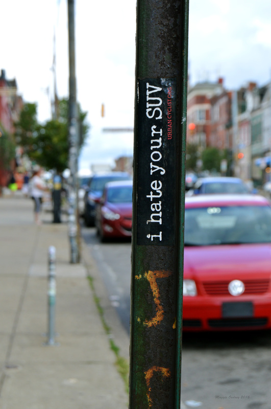 Bloomfield As I mentioned in Tiny political statements, a common use for stickers is to show a person's opinion about society. Some are creative expressions of the artist, making you delve into the image to find all the subtleties of the statement being made. Others are straight forward comments addressing what the creator of the sticker feels about the issue. But no matter what the level of engagement is, these thought provoking images and statements can easily be found anywhere you go.
It doesn't exactly take a rocket scientist to realize that the group behind this particular sticker is concerned about the environment. The SUV has been the hated symbol of carbon emissions for years due to it's higher consumption of gas. It's often held up as one of the most irresponsible modes of transportation out on the market, typically with electric cars being exhibited as the better option. What I find interesting about this sticker is that the group behind it is actually a cycling group. When you go to urbancyclist.org you're redirected to Urban Velo, a no longer active free magazine for city bicycle enthusiasts. It hasn't published a new issue since 2014 and makes me wonder how long this particular sticker has been there. And while it's not an active part of the Pittsburgh cycling community, it does show how big cycling is in the city. Granted Pittsburgh is a far cry from cities like Portland or New York, but biking around the area is definitely growing. There are bike rental shops and kiosks around the city, an increasing number of bike lanes on major streets, and plenty of bike groups to join and support like Bike Pgh. So whether you are concerned about the environment like the cyclists behind this sticker or just appreciate the activity, there are plenty of opportunities to get involved with here. 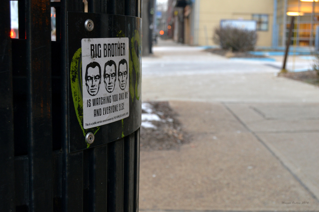 Lawrenceville/Bloomfield Literature has always played an important role in the way we see society, giving us a different lens to look at the world through. But even decades after the novel has been published, some pieces of literature continue to color the way we see the world. They influence the current works of the time, giving us plots, literary devices, and references that are still relevant. And while there are centuries of work that still influence us today, some pieces are so prevalent that they seem to be inescapable.
I'm sure there was an earlier introduction to George Orwell's novel 1984, but the first time I really recall it was in my AP English class in high school. We were allowed to choose a good portion of the literature we read for the class ourselves, with the only requirement being a presentation of the novel at some point in the class. With this free range of reading materials the class became an interesting hodgepodge of ideas, some people gravitating to more modern pieces while others went with older classics. But one book that continually popped up was 1984 and it's concerns about Big Brother. It's certainly not hard to see why, angsty teens who are starting to question the society they were raised in can easily relate to this classic dystopian novel. The concerns it brings up about a government controlling the way we see the world and our thoughts is certainly something that is still relevant to today's society, especially amongst adolescents. While I certainly can't fault people for relating to the fears of Big Brother, I do believe it's become a bit of an over used reference. We have a television show that is partially based off of this idea of constant surveillance, a multitude of graffiti like the sticker above warning people of the dangers of Big Brother today, and you can trace a good portion of the current conspiracy films back to the ideas presented in this novel. I may have become slightly jaded about this because it seemed like everyone I knew was enthralled by 1984, but when I finally sat down and read the book for myself I really wasn't that impressed with it. I vastly preferred the bleak future presented in Brave New World and even Orwell's other big novel Animal Farm to this must read. I completely understand why this reference is so prevalent. The increase of surveillance around the world is ridiculous. We have developed multiple programs that can track our movements and our preferences over social media, creating an easy way to influence our choices and opinions. We have placed easily accessible cameras in places that Orwell would never have dreamed of. And while we certainly have increased the ability to connect with the world around us, we have also created plenty of ways to close ourselves off from it. I guess all I'm trying to say that I wish we would give Big Brother a break and find a new way to express our concerns about society. 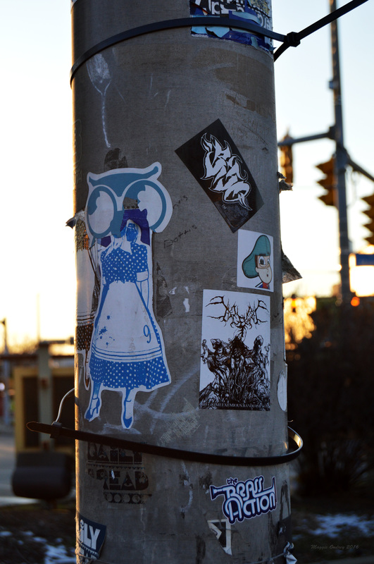 Bloomfield I know I've mentioned it before, but part of the reason I enjoy my personal scavenger hunt is that I never know what I'm going to find. Every sign, pole, mailbox, trash can, and bench holds the potential to be someone's canvas. Sometimes the piece of public property exhibits a single sticker, giving it your undivided attention. But more often than not these communal canvases hold a variety of stickers; sometimes multiple examples of a single artist and other times multiple artists' work. And what's great is that these canvases are never same.
When it comes to communal canvases like this pole behind the Bloomfield sign, it gets to be hard trying to single out just one sticker to focus on. There's clearly two more examples of 9's housewife in a gas mask, a couple of Daily Bread's logo, the Brass Action logo, a partial of an owl, a guy in a cap, and a couple others I can't quite make out here. While I could go into more detail about the ones I can make out, I think that would be a disservice for the whole collection here. Today's post is less of a look at the individual stickers, but how they interact with each other. One of the things I realized early on with this project is that it is constantly ever changing. An object that I took a picture of a year ago or even just a month ago will rarely be the same if I went back today. Stickers are fairly impermanent: wearing away with the weather, getting covered up with other stickers or graffiti, getting torn down or painted over. Each visit will produce a different result, a new collection to photograph. It's also why I post the location with each photo, so you can go looking for yourself and see how the sticker has changed. I know I have other photos of all of these stickers, ones that I can easily delve further into since they will be the sole subject. While I will always try to post new items, new stickers that you haven't seen, there will always be repeats. Ones that are so frequently seen that it's hard not to have thirty versions of the same sticker. But at the same time, each new location gives you a different view and appreciation of the sticker. So with each new canvas I find, I hope to give you the reader a small taste of the city. 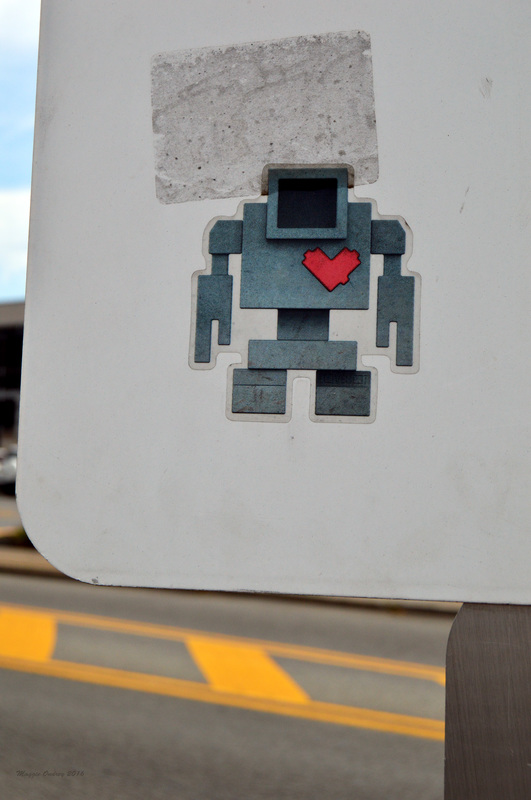 Shadyside I've always known that the stickers I've found around the city are not that unique in the grand scheme of things. Sticker graffiti is a trend that be found all over the world, especially in cities. Obviously a good portion of the stickers here in Pittsburgh are by local artists and fairly representative of the area. But there has always been the chance of finding stickers by artists from other parts of the world, a piece of the larger community and a result of today's connectivity.
I loved this sticker the moment I saw it. It's simplicity, adorableness, and nerdiness just called to me. Granted I was raised to be a Geek from an early age, Star Wars and Star Trek were staples in my household, so robots are always an easy win in my book. However, when I started to do some research into the sticker for today's post, I found even more reason to love this find. Since I couldn't think of any immediate bits of popular culture that would be associated with this sticker, I Googled robot with a heart just to see what I would find. I was a little surprised when I found an image fairly quickly of a larger version of this sticker. Following the image back to it's website, it turned out to be a blog by Toronto native Pixelsam. But like me, he was just sharing a photograph of something he found on the street. So I delved a bit further and managed to find a Wikipedia page for this little robot. Starting as a street art campaign in Toronto, Lovebot was created by Matthew Del Degan to get the residents of the city to be more compassionate and loving to those around them. To take a moment and get out of their robotic daily routines. Eventually it turned into an invasion of little concrete versions of the robot that were placed all over the city in 2013. Lovebot is clearly still expanding it's range, especially since I found this sticker here in Pittsburgh within the last couple of years. I highly suggest checking out their site, since it goes into far more depth about the goals of Lovebot and gives you the chance to explore the statues around Toronto. In any case I am just thrilled by my first international sticker find. http://lovebot.com/ 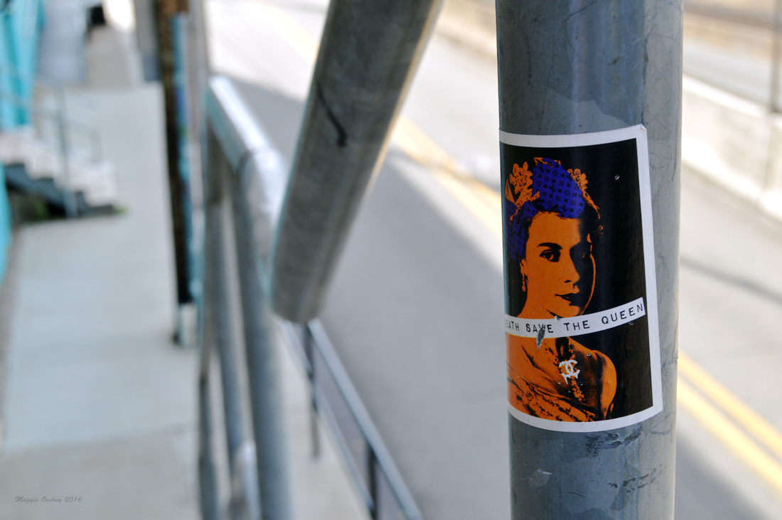 Shadyside/East Liberty A common theme for graffiti all over is it's use in making political statements. Sometimes it's directed at a government or institution. Other times it's making a point about the current state of society. Whatever the intended target is, graffiti is an easy way to make a statement and get people to notice the larger issues at hand. I find this is particularly true with the stickers I find.
I am rather partial, bordering on a fanatic status, to British culture. Classic literature, history, popular culture, and even food from the area are among my favorite things. So this sticker easily caught my attention and has kept me wondering. A pop art version of Queen Elizabeth II's portrait from her coronation 60 years ago is not exactly something I would expect to find in the Pittsburgh Area. I didn't think there was a large British influence here; I can only think of Piper's Pub, a British style pub over in the Southside. Irish influence, definitely, and a growing number of other nationalities have clearly affected the city more than I would credit Great Britain. But then again there is a large Scottish Heritage here, especially when you remember Carnegie, and there is apparently a festival every year celebrating the city's ties to Great Britain. So I guess you learn something new every day. But looking past the obvious element of the sticker, there is a lot that it is trying to convey. The phrase on the sticker is "Death Save The Queen" which plays off the typical phrase, "God Save The Queen." While certainly not the first time someone has made a statement with this portrait and playing with the latter phrase, the Sex Pistols used it for a single's album cover, it definitely is a unique one. Is the artist making a statement about her reign and saving it's place in history or looking to say that something larger about her. Another aspect that the sticker is clearly commenting on is consumerism and our obsession with status symbols. Her hair has Louis Vuitton emblems throughout and there is the clear Chanel logo in her necklace. There are definitely other brands that convey our success and status in life but these two are easily recognizable ones. These brands are things that once you own it you feel like you've truly made it, like you've achieved a higher status in society. And there is no greater status symbol than being the queen. You can see this obsession with the prevalence of knock offs you find on the streets of any city. So this sticker is definitely making a loud statement no matter how you look at it. |
Maggie Ondrey
An amateur photographer and writer capturing a small portion of the city. Archives
August 2017
Categories |
 RSS Feed
