 Friendship This is an odd thing to admit but I kind of hate acronyms. I get that, in theory, the acronym is supposed to make our lives easier by reducing the amount of things you have to remember or say. You use the acronym so you don't have to say the ridiculous name of the computer program every time or to show your support for your preferred groups by wearing their initials on your clothes. I deal with acronyms on a regular basis in my day job actually but that probably just increases my disdain for them. They always feel so arbitrary to me, with what letters you end up choosing to make the acronym out of and how you decide to say it. Why is one program pronounced like a word while another is just reciting the letters? It also doesn't help that for many acronyms out there, there are hundreds of other programs or institutions that use the exact same letter organization. There is also that fact that this acronym trend generally doesn't help with my research for this project.
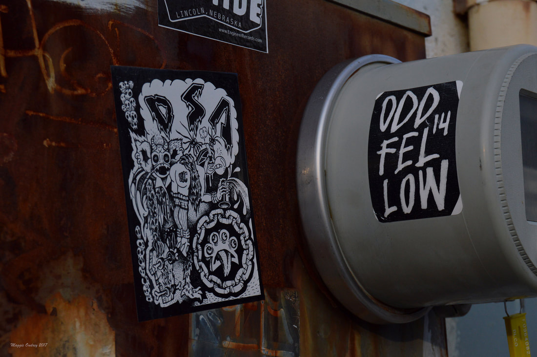
When I decided to look up the stickers in this photo, I got a little distracted by the DSA one and ultimately forgot about the Odd Fellow on the right. By the time I thought to try and look it up I realized that it would be another can of worms, so I decided to just stick with presenting the one can tonight. Alright, honestly finding the people behind the DSA sticker wasn't that terrible since I did end up finding them but it was annoying. Just looking DSA up on Google brings up a wide variety of results with things like the Denver School of the Arts or the Direct Selling Association. And obviously there are far more results than I really care to truly go through for this post. Out of curiosity I looked up what DSA meant on an Acronym definition site and got 157 possible results. Admittedly the most prevalent result was the Democratic Socialists of America, a group that is looking to reduce the influence of corporations and capitalism within our government. My first page of results was mainly links to not only the actual site but also sites that hope to explain what this group is about. But this sticker is clearly not tied to this increasing political movement. After adjusting my search tactics a couple of times, I managed to stumble across a 2014 blog post from one of the members of a band that looked like it might fit the bill. I had a feeling that this sticker belonged to a band but I was trying to keep my search open in case I was wrong in my guess. Luckily the guy behind the post is also the artist behind most of their designs and included a picture of a recent one which included the full name of the band. So after looking up the band's name and searching through their various posts I can safely say that this iteration of DSA stands for Death Sex Advocates. They are a punk band out of Cincinnati and it seems like they are still active. The songs that are posted on Youtube and listed on Discogs are only from 2015, which is a pretty good sign. They also have had some recent posts on their Facebook page. The only thing that kind of throws me off is the fact that the Bandcamp page they have linked on Facebook doesn't seem to work, which is bizarre for an active group. Although it does look like they appear on another group's bandcamp in what looks to be a collaboration out to promote the Punk scene in Cincinnati. Since I've never really gotten into the Punk scene, I can't say I'm a good judge of their sound but I always feel like everyone deserves a listen. I will say that this sticker certainly fits in with their sound though, a little crazy with bits of intrigue thrown in if you look closely enough.
0 Comments
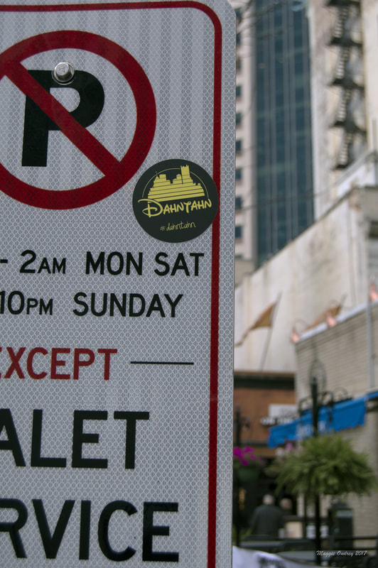 Downtown I wish I had a better way of starting tonight's post but I am kind of at a lost. I've been sitting here for a while actually just listening to music trying to come up with an interesting/ different angle to present things. I mean I've kind of looked at the Pittsburgh accent before and I'm not sure this counts as a reinterpretation or a parody. I also found the people behind this sticker pretty easily, so I don't have to guess at what it is. If I had given myself a bit more time I could have tried reaching out to them for a bit more a story, just didn't think that far ahead this time. I fully admit that this block is truly disappointing though, I really feel like it deserves more than what I can come up with tonight. I've been intrigued by this design since I first came across it walking along Penn in East Liberty. It is a simple and easily recognizable thing, making it hard to forget and something I see fairly often now. I've found it in a couple of neighborhoods so far but I think this one is probably my favorite. I was just so excited that I managed to find it in Downtown with some of the skyscrapers in the background. It's not often I happen to come across such good circumstances for these stickers. I guess I should break down the elements that make up the sticker, now that I've vaguely gone in a circle. The word "dahntahn" is another example of the fabled Pittsburghese accent that locals boast. I've certainly seen it a couple of times in advertisements and such but again can't say I've ever actually heard someone use it. Then again I can't say I've had that many conversations with random people about Downtown. A big element that makes this sticker memorable, at least for me, is it's play on the Disney logo. Granted Disney has updated their logo in recent years to be a tad more realistic but the simple striped Cinderella castle is the version I grew up on. I do think it's rather clever of the people behind this design to transform the Pittsburgh skyline into a similar style, since you can pretty much guarantee that an entire generation would be drawn to it. Speaking of the creator, the minds behind this sticker are a group/ shop called Dahntahn. While they don't seem to have much of an online presence at the moment, it just appears to be a Facebook page right now, they have managed to get their products out there. Skimming through the posts I saw that they can be found at Kards Unlimited over in Shadyside and were even selling these shirts at Zeke's coffee for a bit. It looks like they've done a couple of other shirt designs but this play on Disney seems to be their biggest seller, which I can understand. Oh and since it came up while I was looking for Dahntahn, I figured I'd share. Night folks. 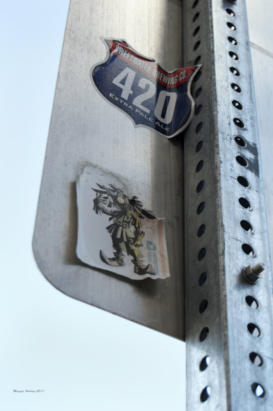 Southside By the time I actually get this posted it will officially be my favorite holiday, so Happy Halloween everyone!! I know it's terribly cliche, the girl with the macabre inclination loves the spooky holiday, but some things can't be helped. First of all it's a great excuse to get caught up on classic horror movies. I even get a kick out of the 13 Nights of Halloween on Freeform although I usually have to stop on day 3. There's only so many times I can watch The Addams Family and Hocus Pocus before I start going a bit batty. I adore going to haunted houses, even if I am the one who jumps the most out of the group every time. As soon as the Halloween stores open and the section pops up in Target, I make a stop there every visit. I can't tell you the amount of times I almost walked out the store with a skull just cause. I'm also a huge fan of the costumes, having that ability to be something other than yourself or to show a different side to your personality is such a fun thing. Granted about half of the time I don't actually dress up and the other half rarely works out the way I hope it will, but I still love the possibility.
I was trying to find an appropriate sticker for the evening but I don't seem to have a really spooky one ready at the moment. However I figured this sort of fall themed one was a good way to celebrate the holiday. Well at least I think it's "fall"ish. When I look at this great hand drawn piece I think scarecrow, which are a staple to Fall and Halloween. Traditionally used as a deterrent for crows and sparrows to keep them away from crops, examples can be found all over the world. They have also become very popular in pop culture, often in a sinister fashion. I mean there's the Scarecrow in the Batman comics, an episode of Doctor Who where scarecrows attack a British school, and countless other examples that even I was a little surprised looking a list of them all. There is just something eerie about those cloth faces hiding what is actually inside. I will admit that the longer I look at this sticker, the more I wonder about what it is. I swear that this looks like something out of a video game, something that I've seen pictures of people cosplaying as but wouldn't have a clue what they were. There is just something about the face that makes me think of a tribal mask of some kind. If any of you happen to know what I'm thinking of I'd love to hear it, just to see what it is. Before I sign off for the evening, I did want to quickly link to the other sticker on the sign. This 420 sign is a logo for a particular craft beer for a brewery. It seems like the most of my sticker finds any more are for beers, not that it's a bad thing just an interesting fact. Sweetwater Brewing Company is a brewery located in Atlanta GA and has been creating beer since 1997. The 420 Extra Pale Ale appears to be their most popular brew and is described as a West Coast style pale ale. Now to me this really doesn't mean anything. I know that Pale Ales tend to be a little lighter of a beer and something that I don't mind drinking as a change of pace. I will admit that while I enjoy craft beers, I really don't know the actual differences between the wide variety of types. So looking these stickers up is often an interesting adventure, reading a description and how it actually translates into a taste are typically very different creatures, making these bits of research a bit fruitless. Although it does typically peak my interest, and hopefully yours a little, enough to keep an eye out for them to give it try. 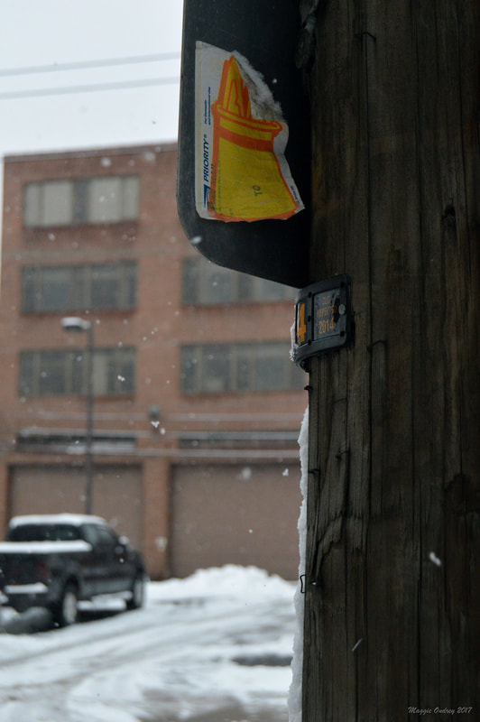 Strip District I'll admit it's a little early in the year for a snowy setting like this, despite the recent drop in temperature it is only October and honestly not that cold. Sure I've started to layer up already but I'm a wimp and refuse to turn my heat on unless absolutely necessary. Looking through my collection that's ready to go though, this is the photo that I was the most impressed with the most. I enjoy the snowy background and love the fact that I managed to capture some of the falling snowflakes as well. I also like the fact that the snow was collecting on the edge of the disintegrating sticker when I found it years ago. This photo was actually among some of the first ones I took when I started the project up again, I just don't have a particular reason as to why I held off on posting it for so long. Well part of it was a doubt that I'd actually find anything on it, which I ultimately didn't. While I couldn't find anything on the internet for it I have recently walked by a spray painted version of this on my way to the bus stop. I think it was this recent find that prompted me to give this one a shot. It's also a subject matter I can really relate to.
I've always found magic to be fascinating, even when I was a kid. I can't say that I've ever really believed in magic, I've just always been drawn to it. I'm not sure I've mentioned it before but I'm definitely part of that generation that grew up on Harry Potter. I don't think I started reading the series until after the second one was out as a paperback, although it was most likely much later than that. I think what I loved about the series was the way that Rowling not only created a new fictional world to draw you in but also brought in elements that you easily recognize from other areas of folklore. This idea of creating new worlds while referencing the old has drawn me to other similar stories, like the show The Magicians (although I will admit I'm not sure for how much longer with that). Technically tonight's sticker has nothing to do with that type of magic though, since it is rabbit in a hat this would be more akin to stage magic or illusions. Those people who look to entertain and astound the world with tricks and truly creative inventions to make the impossible seem real. I feel like my fascination with magic has recently taken a bit more of a turn towards this side of the magical arena. With films like The Illusionist and the recent Sherlock Holmes movie, it's that slow reveal of how it all worked out that gets me. Yes technically they're more a mystery than actual tales of true magical performances, but that idea of not being able to trust your eyes is a big part of these stories. One of my favorite books right now actually manages to combine both of these elements. The Night Circus is about a couple of magicians who perform real magic in the form of stage magic to hide it's true nature. But whether you prefer your magic as a trick of the eye or as a fictional world with real spells, everyone has to get a kick out of a rabbit in a hat. 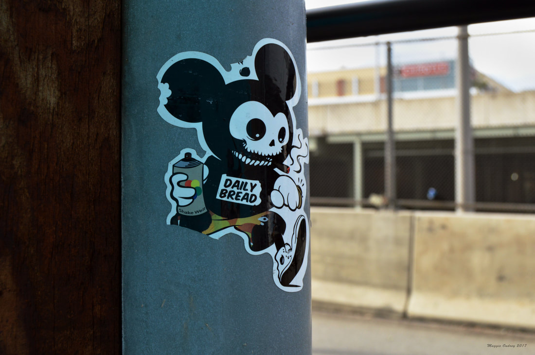 Shadyside I know I've linked to this particular shop a couple of times but I don't think I've ever really shared much about it before. It was one of those things where every time I found it there were other stickers that seemed like they would be a better discussion and often I kept thinking I would try to reach out to the shop to get more information from them. But at this point I feel like if I don't share this sticker now, it will just remain in the queue forever. I just kind of love how bizarre this image is and knew that it needed to be shared. Clearly you can tell this design belongs to Daily Bread, since it does say the shop's name on the chest. The name is also in that usual shape of the state for their alternative logo that you will see around the city. What makes this image interesting for me is the play on Mickey Mouse or the generalized animated mouse that you tend to see. I love the mischievous nature of the mouse, with the can of spray paint and the cigar in his mouth. The skull of his face is also a great addition to the image. Now I'm not sure if they are making a statement against Disney, commercialism, or something along those lines, it is just a vague enough image that it really could just be the shop creating something fun. I feel like it does fit the style of the shop's clothing. They do tend to be toeing that line of classic tee shirt, hoodie style with truly unique statement pieces.
One thing I did find interesting about looking through their website is how this particular shop is tied to two other stores. So when you get to their About page you can see that while they also have an Instagram, a Facebook page, a Tumbler account, and a Twitter account tied to the store, there are also links to Refresh PGH and Timebomb. It looks like when they expanded their offices a couple of years ago they created a space on Penn where they could collaborate with these two other stores. Refresh PGH is a store that focuses on selling and cleaning sneakers. What's interesting is that they are a consignment shop, so they work with individual sellers to get their sneakers valued and sold to people who will really appreciate them. Along with Refresh PGH there is also a collaboration with Timebomb, another local unique clothing shop. Now it doesn't look like their site is currently up but their Facebook page and Instagram are still out there. Now I recall walking by Timebomb on a regular basis when they were located on Highland Ave, which is actually pretty close to where I found this sticker, but they have clearly moved. I assume that they are now in the Penn location with the other two shops, although I will admit I'm not entirely sure. Granted I've walked by the shop on Penn and have definitely noticed the storefronts for Refresh and Daily Bread, I just can't say I've ever went in to see how it's broken up. But no matter which one you're looking at, they are a truly unique stores with great statement pieces throughout. 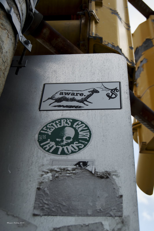 Bloomfield So far in this project I've featured quite a few big graffiti artists, or at least linked to the ones that I could find. Some of the more local finds were Sarah Trobee and I've recently figured out, or at least I think I did, that I've featured Jeremy M. Raymer on here as well. There have also been artists from outside the area like Question Josh, Vinny Raffa, chrisrwk from Robots Will Kill, Lovebot, and of course Shepard Fairey. Each of these artists have a unique style but all of them are looking to make a statement of some kind. A couple are out to point out the dangers of modern life and not paying attention to the important things. Others will have a slightly more political inclination with the work they put out there in the world. And I'm pretty sure a couple are just looking to get something out of the norm out there to give people a reason to just pause in their life for some art. No matter what the reasoning is though, graffiti is an essential element of any society. It gives us a way to vent our frustrations and to see that we're not the only ones feeling this way. It also allows for people to feel like they are making a mark in the world, even if it's temporary.
Tonight's photograph does feature a couple of stickers but I really didn't think I would have much more to say about Jester's Court, so I focused all of my research on the aware. sheep. This sticker has fascinated me since I first found it. While I do enjoy the sticker's style, it's the message that has kept me interested. Now I'm not sure what your interpretation of this image is but my immediate reaction was that it was looking at the socially conscious consumer. I will admit I'm probably a little bias on this idea, since I've never bought into the whole organic and clean food movement, but I just can't help feeling that half of the people who have are just doing it because it makes them look good. That people are willing to buy these "organic" and "healthier" products so that they can make it a conversation piece. I rather doubt that this is actually the case for people, it just feels ridiculous when you're wandering through the grocery store or heaven forbid Whole Foods to look at the prices and feel like it's worth it. Yes I know Amazon has recently bought the grocery chain and changes will be coming, although the fact that changes need to happen kind of proves my point. For me this sticker is saying that the "aware" consumer is like a herd of sheep and are willing, if not specifically looking for, those more expensive products to feel like they are being better to the world. Although after looking at the people behind it, I don't think that this is the message they are going for. It took a little bit of creative research to find the creator of this sticker but not as much as I thought it would. The first positive result that I got was again another Hive Mine collection that featured this design as an image on the side of a train car. Looking through the other images in the collection, I realized that "aware." was actually a fairly tag and meant that I should be able to pull up a better result. On my next attempt I did manage to find this image as a shirt design and discovered the minds behind it. Indecline is a group of artists from various mediums and activists who work together to make public statements across the country and occasionally the world. They established themselves back in 2001 and have made quite the name for themselves with their work. While they are always out to make political and social statements with most of their pieces, some of them have really come into the public's eye. I was a little surprised when I saw that the recent statues of a naked Trump that have popped up around the world was actually one of theirs. I also realized that a couple of other stickers that I've really enjoyed over the last couple of years are also theirs. One big thing that I noticed though is that one issue the artists in this collective really address is this county's problem balancing work with life. They've done a couple of stunts involving a billboard and a hanging mannequin, from a noose mind you, condemning corporate America and Wall Street. With this in perspective, I now wonder if this sticker is looking to point out that everyone is a sheep blindly following the promise of money and better lives. Although as with all graffiti it's not always the true message behind the image that matters but the conversations they create. 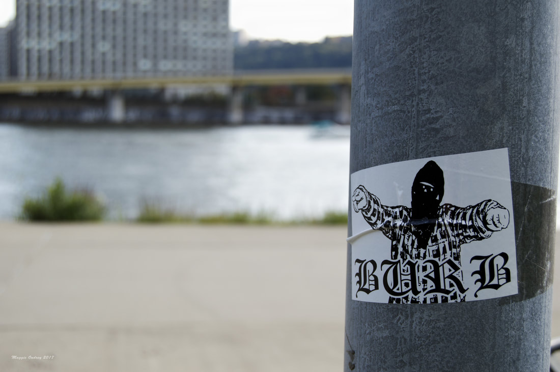 North Shore Hmm, I have to admit I'm a little stuck with where to begin. Doesn't really help that I couldn't find much on the sticker and the fact that Google really thought I wanted to find a "burp" gangster, sticker, and graffiti. The meaning behind this sticker is fairly clear, well at least I think it is, but it's not exactly the easiest thing to relate ideas to. For me, this sticker is making a statement about cultural appropriation. Burb is generally just a shortened version of suburb, a community near and outside of a city. Now suburbs tend to have mixed feelings surrounding them. They are usually viewed as a more affordable way to own property and typically nicer areas to live in. But at the same time, most of these communities were founded on fairly racist practices creating areas lacking in diversity and are highly reliant on cars for transportation. So while the suburb is certainly not going away, there has definitely been some backlash in recent years.
Now getting back to tonight's sticker, one sight that came out of these locations was the suburban gangster. Since the internet has made it easier to share music, ideas, and other elements of culture it's not surprising that people all over the world will pick up on things that they might not have in earlier generations. Or at least not with the same speed or become as widespread as it has been recently. One of the bigger pieces of cultural appropriation that I really remember was the rise of the "gangsta." Even people in my small town would listen to rap, dress in baggy pants, and act like they were from the stereotypical vision of the ghetto. Now I'm not saying there's anything wrong with appreciating music and styles from other areas of society, but it does get a little ridiculous when you're acting like a badass who's seen shit even though it's terribly unlikely that you would have. So for me this sticker is critiquing the people from the "burbs" who dress and act like they're from the inner city. I rather doubt that it's trying to say something else but I am curious if this is part of a larger statement and who is behind it. Also I am sorry if this is as much of a rambling mess as I feel it is, just one of those nights where I just keep hopping from one idea to the next. 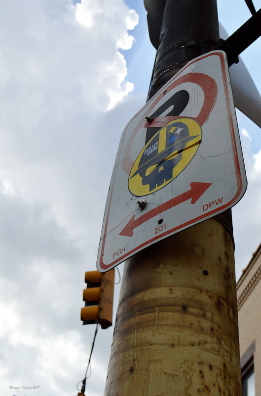 Garfield The first time I saw this sticker, I was actually on the bus. Every day I would take a bus down Liberty Ave to get to my job in the Strip District and it was on one of these regular trips that I happened to notice this sticker out the window. We were stuck at a light at the time and I have to admit that I was fairly surprised to see this skull with the Steeler's logo out there. From the first time I saw this, I thought it was more of a statement on Steeler Fans than anything else. I mean sure skulls are tough and badass but not something I would associate with the team. I also felt it was odd that the sticker is for the Stiller Gang. I know that Stiller is a common moniker for the team, especially around the city, just unusual to see it actually spelled out. Although I thought the hard hat was an interesting addition to the image, truly embracing and representing the Pittsburgh spirit. So when I decided to start the project up again, I knew at some point I would have make the walk up Liberty to actually photograph this sticker that had been capturing my attention every morning. While I do have that exposure, this obviously isn't it. This one came from a later walk and I kind of preferred the play of the signs with the sky in the background.
Looking into this sticker, it turns out that the Stiller Gang is just a group of dedicated fans. According to a brief interview the founders did back in 2016, the group started in 2011 apparently at a Bengals game. Like most of Steeler Nation, this group's following and association has spread across the nation. Supposedly they are so far spread at this point that they even have members over in the UK. Although that is to be expected to some degree, since Steeler Nation has had fans across the country and around the world for decades now. To connect this offshoot of the Steeler fanbase, the group has a Twitter account, an Instagram account, and a Facebook page. Although the Facebook page kind of threw me for a loop since it's called The Terrible Tailgate. Now it's not unusual for there to be subsets of Steeler fans out there. On the Steeler Nation Wikipedia page it lists 9 different groups that started in the 70's when the Steelers started to truly capture the nation's attention. If I was actually a sport's fan, I'm sure I would have known most of this already. Well I did kind of know about Steeler Nation since my dad has been a fan his entire life and I've got relatives who were fans despite the fact that it was more common to see a New York game on the TV. But I have to admit I was intrigued to see the dedication of the fans and how many followers there are on all three of their social media outlets. Certainly no where near the numbers of the team itself but nothing to sneeze at. 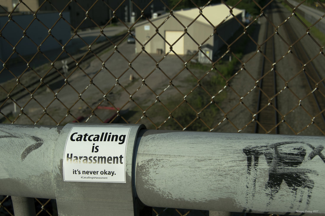 Polish Hill Every summer there are songs of the season, big blockbusters in the theaters, and the can't miss events throughout the city. This year I had a sticker that rather defined my summer. I'm not sure when I first saw tonight's sticker but I know I've come across it all over the city. Not only me actually, I've had others show me examples that they've found of it. One person was telling me that she's seen one of these in the middle of a tunnel. Now I could go into my experiences with catcalling or look into the issue at large but I feel like this would be a great disservice to this statement piece. Luckily for me, the #catcallingisharrassment tag at the bottom of this sticker does bring up some pretty clear results. Obviously there's the Instagram and Twitter results for this hashtag, but they are a mixed bag of the sticker and people's conversations about the problem. My Google search results also happily brought up the person behind this creation.
Projectile Objects is the site of the VJ Cornelius. He generally creates music videos and projection mapping for various groups. You can actually find some of his projection work at Spirit, the pizzeria in Lawrenceville, and he had a recent collaborative effort at the Mattress Factory back in January. Since his work seems to be mainly visual manipulations, I was truly curious about what influenced this slight deviation to his typical style. Now he does speak briefly about it in his blog that he has on his site but I wanted to see if he would be able to speak with me about it. So what follows is our brief interview that may be one of my better ones so far. Well I guess to start off with, who are you? :) That’s always a challenging question to answer. I am me. Always changing, growing, learning. It’s not really a question I can answer. Are you originally from Pittsburgh? If not what drew you to the area? I grew up in a suburb of the city, Monroeville. A normal middle-class kid with a small family. Looking over your site Projectile Objects, I see you're a VJ who specializes in projection mapping and visual remixing. What drew you to that field? I used to make hip-hop/ rap music videos from 2003-2008 in Pittsburgh. Not much competition back then and youtube didn’t exist or even Myspace Video. DVD’s were expensive, but digital cameras had evolved to HD and Final Cut Pro allowed us to make “high quality” on a low budget. As years passed and technology costs dropped — so did the music video budgets. I originally started VJing in an attempt to edit music videos in real time. (Bypass the week long edit and do it in a day (or an hour)). In 2008 I figured out how to do it, but there were hardware limitations that have since disappeared. Once I learned how to edit music videos in real time, I stopped making music videos and started VJing. This naturally progressed into Projection Mapping which was a small extension to my VJ workflow. In general what are some of your influences artistically? No rhyme or reason to it. I’m a sponge in the world around me. The only thing that shapes my creativity is a motto to “Create not consume!” and a “hanged man’s” (tarot) perspective. Since you're more of a visual media artist, what drew you to creating this sticker? & Why this particular issue? My friend and I had some lengthy conversations about their catcalling experiences and it ran around in my head until I came up with these stickers. At first I thought the simple message and plain visible text would help catcallers to understand that they are harassing people, but I was wrong. At the end of the day, the most important thing that these stickers can do is to start a conversation. At least half our population knows that this is a problem because they are the ones affected by it. Cat-Callers themselves, make up a small portion, but it is the rest of the “men” out there that stand by, contribute, or even worse, justify it being apart of their liberties. It’s street harassment and a bigger problem then some people care to think. All of which allows it to perpetuate. I saw that you put the image file out there for others to print the stickers out for themselves. Have you seen a lot of people do this? I'm not sure if you can track it but has it popped up in different cities? I’m not sure if anyone else has printed them. I know they’ve spread across the country. Close to 9,500 of them have disappeared. The first 500 in one night. The next 3,000 in less than 24 hours after getting them back from the printer in the mail. I couldn't print them fast enough. Now I'm running low and finding a quality printer who can make the hard to remove destructible stickers is a bit more challenging than you'd think. Do you have a favorite spot you've seen the sticker so far? I’ve saved a lot, but this was one I saw that helped shape my thoughts on the sticker: https://www.instagram.com/p/BVVQpoLA1P6/?taken-by=rich_frollini The photo was taken by a guy while he was at the gas pump. He asks, “So this is a problem at the gas pump?” and the first comment was, “You’d be surprised…” Of course, it happens at gas pumps, at bus stops, in public places, bars, Walt f**king Disney world, it happens all the time, so for this guy to even ask a question and for someone to answer — that’s the start of a conversation. Maybe he will learn, maybe he won’t. Maybe someone else will learn, maybe they won’t, at least it's a start. To answer your question, at the moment Gas Pumps are my favorite. Highly visible in high target areas that station employees never seem to take down. And on top of that, if someone wants to rip down or deface a sticker, they are doing it in public for all to see. https://www.instagram.com/p/BWRBt03gwAM/?taken-by=kyfacch https://www.instagram.com/p/BXYger4B8vl/?taken-by=mx.klevie Also, the first 3,500 stickers didn’t have a #hashtag on them so I don't know where they could have gone. The third run of stickers included the # after I heard stories of where people put them (even physically on their harassers) and wanted a way for those stories to be shared publicly. They shared a story in this post: https://www.instagram.com/p/BUPx6K-BoTT/?taken-by=travelingfeminist Is this a project you hope to continue? Are you thinking about creating other stickers? Are there other issues or ideas you'd like to address? I want it to continue, but these stickers are not enough. I have some other ideas and expect to do more in 2018 to combat this problem. Do you have any upcoming projects you're excited about? Lots, but no other stickers planned. With the help of Lili Cafe & Espresso A Mano, we placed our largest order to date for Black Lives Matter Wristbands. I look forward to seeing more of these spread through a city that needs to break its racial divide. At the end of the day, these are issues that affect us all and injustice for one is an injustice for all. Feel free to expand or mention anything else you want to. Thank you again for taking the time to answer these. I only wish that there was more that the city and local law enforcement was doing to combat street harassment. Instead, I hear plenty of stories about Pittsburgh Police officers catcalling friends of mine and the city tears down the stickers to help “clean up our streets.” :/ 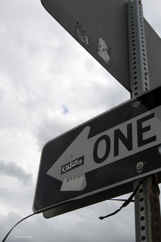 The Bluff/ Oakland I hope you don't mind but today is going to be me geeking out for a bit. Looking this sticker up on Google is obviously a bit problematic. There are just so many results that come up for the word Killbot that it's hard to tell what's related and what's not. There are bands with this as a name, song titles with it, video games, animated characters, and so many related ideas that it's a bit ridiculous to think I'll actually find this particular version tonight. Now I will admit that in the Hive Mine results I did come across a couple of other examples of this graffiti style, including one photographer's capture that I was impressed with. Although the further I go into the results the more varied the styles of Killbots become, so I don't know if they're all the same artist or not. There were also a lot of photos of a band with the tag of Killbot in these results, which again may or may not be related to this particular sticker. Since I'm not really sure what direction to head in to find the artist at this point, I decided to talk about robots. Now I have been a big fan of science fiction for most of my life. It's a bit of a family obsession across a broad media spectrum and we are constantly sharing our finds with each other. If there is one constant in all of our preferred outlets for sci-fi, it's robots. In fact my one brother's favorite thing in all of science fiction is the giant robot. Now as I've learned from listening to recent podcast episodes about technobabble on Imaginary Worlds and The Allusionist, the word robot actually first appeared in a play from 1921 called R.U.R. What I find interesting about this is that the story is about mechanical men who are built to work for humans and eventually revolt against their "masters." So the idea of dangerous robots rebelling against their creators has been there from the beginning. It isn't exactly a bizarre concept, since the word robot does come from the Czech word for slave and rebellions are the natural result of forced servitude. The idea of the robot has evolved over the years: there was the Maria doppelganger robot in Metropolis, Issac Asimov's rules of robotics that many will know from the movie I, Robot, Robby the Robot in Forbidden Planet, the android replicants of Blade Runner, the Cylons in Battlestar Galactica, and many many more. Robots are so prevalent in sci-fi that it's actually rather hard to simplify into single thought relating to this idea of killbots. Although the show Futurama actually does have robots that are specialized "killbots" from Momcorp, which were always great. In the end no matter what your favorite version of the robot is, there has always been that undercurrent of danger in it's past. Although the robot's relationship with humanity certainly continues to look turbulent judging by the recent movies and shows that have come out. 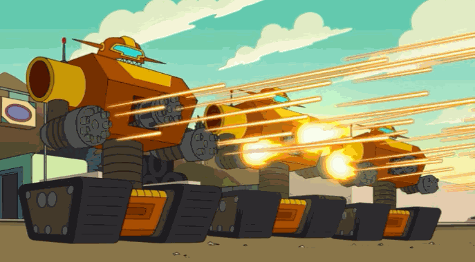 |
Maggie Ondrey
An amateur photographer and writer capturing a small portion of the city. Archives
August 2017
Categories |
 RSS Feed
